

Ancillary Tasks
History of Ancillary Tasks
For my ancillary tasks I have chosen to create a film poster and a magazine review page for my main task. When analysing these I found a range of codes and conventions that were included in order to represent a specific genre.
 |  |  |  |
|---|
-
In these film magazine reviews they have included large still shots from the films to give the audience an understanding of the film in just one image.
-
The article is divided up into small columns so that it does not obstruct the audience's view from the main image. The film title and magazine title are also placed in these places for the same reason.
-
Font colours are simple yet match the colour scheme of the main image to maintain a persistent theme for the magazine.
-
Small facts about age rating, release date, directors, actors, and running time are malso included to inform the audience all they need to know for the film.
Mock Designs
By having Sedly's character show this facial expression of confusion, it portrays the comedic narrative of my main task. This will also make the audience question the purpose of his body language towards the female character, Louise.

White background so that the main images stand out and also to maintain a simplistic layout so that the colour scheme is not overpowering.
Louise's facial expression gives an insight to the audience the type of personality she has, again showing the comedic element of my short film.
I thought it would be a good idea for Louise to pose this way as it shows her assertive character which breaks the conventions of stereotypical representations of males and females and females are usually the shy characters.
Positioning the film title in the middle straight away catches the audience's attention as it acts as the focal point, especially due to his bright font.
I also created another design but decided to have it portrait to test out what styles would look better.
By having both characters looking right at the camera it shows the idea of how they are somehow trying to communicate directly with the audience, perhaps asking for our 'advice', especially in Sedly's case. This therefore hints to the audience a little bit of what the narrative could potentially be.

Again, similar to the first mock design, Sedly's expression of confusion highlights his personality and his feelings towards his and Louise's situation, representing the comedic element of the film.
I decided to choose this slogan for the film as it gives the audience an insight of what the film will potentially be about, also leaving a slight cliffhanger with the use of the unfinished phrase 'Will you be my...'
I particularly like how the red and white combination of the font of the film title still stands out on top of their clothing which shows the colour theme is a good choice.
'InCinemas' logo so that the audience can locate the film section and review page of the magazine.
Laying out the film review landscape is a good idea as it gives enough room for both the images and text without appearing too crowded.
I have used text boxes to layout where the writing would go and how to set it out. The best way is to divide the writing into columns as this is what the majority of magazine film reviews look like.

Having three main shots from the film gives the audience an insight to the film without revealing too much. I chose these scenes as they are the most important ones.
Page numbers so that the film review can be easily located.
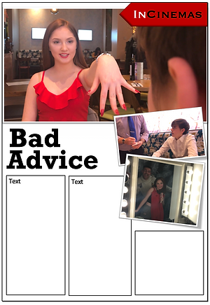
I particularly positioned the 'InCinemas' logo on the right hand corner so that it does not block the main image.
I particularly prefer the portrait layout of a film magazine review as it gives the impression to audience that the article is not too long to read which will save them time.
Giving the images a polaroid effect adds some character to the images, highlighting the playful aspect of the film.

Ancillary Poster Version 1:
For the first version of the film poster I wanted to create a simplistic one first to show my peers the layout and colour scheme I was aiming for before gaining feedback on what to include next. Usually films have different versions of posters to act as teasers for the upcoming of the film for example one is plain and simple while the other includes critic reviews/ratings and social media links.
Ancillary Poster
Draft 2:
After gaining some feedback from peers, I decided to adapt it and create another version of the poster to include things such as film review ratings, production company logos and social media websites to ensure that it resembles current film posters. This will also boost the marketing of the film as audiences are able to read more about it if websites and social medias are included. The use of including the film reviews/ratings also helps to boost the film's popularity knowing that professional film critics have enjoyed and given a 5 star rating.

Ancillary 2:
Magazine film review
